

Wednesday, November 9, 2011
The Marvelous Moustachin
One of our designers, Sach, has manned up and is taking part in Movember. Sponsor him here, and laugh marvel at his moustache here:
Monday, September 5, 2011

Thursday, July 28, 2011
award for the most creative use of structure goes to...
 Spotted by Nik in Harvey Nichols Food Market
Wednesday, June 29, 2011
our favourite websites
Next in our occasional series where we share a few of our favourite things...


 From top: Snippet & Ink; The Sartorialist; Design*Sponge; Garance Doré; Friends of Type; grain edit; The Cool Hunter; ShareSomeCandy; Etsy; Made in England; Butterflies and Wheels; BBC; The Daily Mash; spiked; Harry's Place; MoneySavingExpert, Spotify.
From top: Snippet & Ink; The Sartorialist; Design*Sponge; Garance Doré; Friends of Type; grain edit; The Cool Hunter; ShareSomeCandy; Etsy; Made in England; Butterflies and Wheels; BBC; The Daily Mash; spiked; Harry's Place; MoneySavingExpert, Spotify.
Thursday, June 9, 2011

Monday, May 23, 2011
our favourite artists/designers/illustrators
The latest in our occasional series where we share a few of our favourite things...


Monday, May 16, 2011
dead famous

Big excitement in the studio last Thursday when our senior designer Jessica was plastered across page 3 of the Evening Standard... after spending the night in a haunted coffin to try and win a trip to New York. In a feat of endurance and bravery she lasted the night, won the trip, and made us all proud! Click here to read all about it.
Thursday, May 5, 2011
our favourite food/drink packaging
The latest in our occasional series where we share a few of our favourite things...


Tuesday, April 19, 2011
badges of colour
I love finding out about new artists, especially when they are local to me (writes Amy)...
On a chilly Sunday morning a few weeks ago I was having a wander around Muswell Hill with my boyf... I needed a quick retail fix so left Matt outside to entertain himself. When I met back up with him he was taking photos of the floor – I thought he’d gone slightly mad but when I looked down I saw a blanket of colour & pattern. On closer look there were loads of tiny little pictures that had all been created on top of discarded old chewing gum...
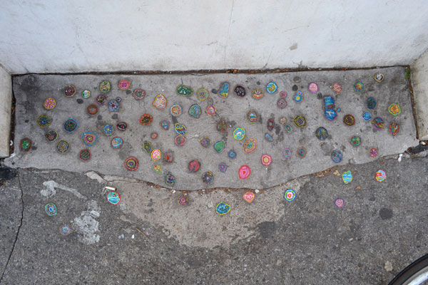


As soon as I'd spotted these pieces of art it was impossible to not keep looking down at the floor - there are hundreds around the streets of Muswell Hill, but apparently they appear all over London so keep your eyes peeled!

The artist is Ben Wilson and you can find out a little more about what he does by visiting this BBC report.
On a chilly Sunday morning a few weeks ago I was having a wander around Muswell Hill with my boyf... I needed a quick retail fix so left Matt outside to entertain himself. When I met back up with him he was taking photos of the floor – I thought he’d gone slightly mad but when I looked down I saw a blanket of colour & pattern. On closer look there were loads of tiny little pictures that had all been created on top of discarded old chewing gum...
It sounds pretty disgusting but these little 'badges' of colour were amazing, packed with loads of detail! Thinking about it, I had often seen a guy lying on the floor with a paint brush in hand (as you do) and wondered what he was up to… well, now I know!
As soon as I'd spotted these pieces of art it was impossible to not keep looking down at the floor - there are hundreds around the streets of Muswell Hill, but apparently they appear all over London so keep your eyes peeled!
The artist is Ben Wilson and you can find out a little more about what he does by visiting this BBC report.
Thursday, April 7, 2011
bass notes
 Kemistry Gallery in Shoreditch was recently showing an exhibition of Saul Bass movie posters, and a few weeks ago we shut the studio early to go and take a look (writes Jess)...

Story board for the shower scene in Psycho which he is actually rumoured to have directed!

Anatomy of a Murder - my pick of the show.
His film titles are incredibly simple - which is the beauty of all Bass' work and why even now he is revered as one of the all time greats of graphic design. His work is very obviously the inspiration for modern day credits such as "Catch Me If You Can".

The exhibition is now closed, but it's worthwhile having a look on YouTube for more of his film titles, they're exactly like his posters, bought to life through really simple animation... beautiful.
Thursday, March 24, 2011
drawing fashion
A couple of weekends ago I went to the Design Museum, London (writes Peter) to see The Brit Insurance Design Awards, billed as "the Oscars of the design world". I wish. Unfortunately, I soon found myself overwhelmed by the mess of projects, exhibits and unclassifiable stuff I couldn't understand or relate to. Nothing like as exciting as the 2009 show.
Luckily on the floor below was an exhibition of fashion drawings which made the trip worth the effort.
The exhibits and exhibition are small but the scope is as vast as it is fascinating, featuring a whistle stop tour through haute couture fashion from the 1920's onwards. And all seen through the eyes of some amazingly talented fashion illustrators.

Others with painstaking filigree detail in watercolors...

While others adapted contemporary pop art techniques to show off 60's pop art fashion...

Luckily on the floor below was an exhibition of fashion drawings which made the trip worth the effort.
The exhibits and exhibition are small but the scope is as vast as it is fascinating, featuring a whistle stop tour through haute couture fashion from the 1920's onwards. And all seen through the eyes of some amazingly talented fashion illustrators.
Some captured a 'look' in a few gestural brush strokes...

Mats Gustafson, “Red Dress”, Yohji Yamamoto 1999
Others with painstaking filigree detail in watercolors...

George Lepape, Vogue cover 1919

Antonio, New York Times Magazine 1967
Glamorous, inspirational and absorbing. Plus not one pixel of computer-generated images on display.
Monday, March 7, 2011
hot off the {apple} press

Here's a sneak peek at some of our latest work in Scandinavia. Quite literally hot off the press and into Stockholm's coolest bars, Gravendal cider's new design rolls out in Sweden over the next few months. Check our main site for the full Gravendal story soon.
Thursday, March 3, 2011
range architecture - the blueprint for brand success
Just as great buildings need good foundations and a clear structure, brand and product architectures are no different in how they should be approached (writes Lawrence, MD).
Brands have a life span. For many it's short, but others flourish and generate meaningful income. Consumers’ relationships with brands also have a life span, driven by generational changes or more quickly by changes in habits, taste and lifestyle.

However, I find Nivea much more difficult to deal with. Anti-wrinkle, firming creams, firm and natural body lotions, Nivea Visage, Nivea Soft, Nivea Pure, Nivea Sun through to Nivea Men... between them creating a plethora of range names and sub brands that makes it difficult to decipher what I am being offered and how I should find what I actually need.

And there are many more examples. Biscuits, for instance, are becoming ever more diverse, and Fox’s does a good job of presenting its variety of biscuits by using design to reflect the different styles of each one.

And whilst Old El Paso in the Mexican wraps category does a terrific job on consistency and stand out on shelf, I’m left wondering what’s inside the boxes and the wrappers!

Getting the range architecture right ensures that the platform is there for branding, design and message to be used to convey product or brand differentiation to optimum effect. Get it right and you’re away. Get it wrong and even a small range can create confusion.
Brands have a life span. For many it's short, but others flourish and generate meaningful income. Consumers’ relationships with brands also have a life span, driven by generational changes or more quickly by changes in habits, taste and lifestyle.
For brand owners, reacting to these changes can be a challenge, and this often results in brand and product portfolios becoming bloated and poorly focused with little differentiation. Ironically, it's often easier to add another product to a brand's range than it is to change or delist an existing product. This is partly due to brand owners hedging their bets, and partly due to a production-led management strategy. Consequently, these bloated portfolios are more likely to confuse consumers and cause them to lose engagement with the brand they once cherished. And they become expensive to support.
The answer to this set of problems lies in range architecture
A range architecture review should begin at the point that will effect the best commercial outcome, which means exploring the brand's connection to the company's business and product strategy.
Range architecture should always refer back to commercial priorities, meaning fewer distractions from the softer science of tactical qualitative research, good guesses or an over reaction to market changes.
Of course, many businesses have extended their brands’ product portfolios over recent years. Good brands are powerful assets and consequently are seen by their owners as having the capability to accommodate more products, beyond those they might be recognised for. But this needs to be carefully managed.
Examples of good and not so good
In health and beauty, for example, Johnson’s has managed to retain brand integrity across its entire portfolio as it moved from its core offer of baby care through to women's face and body care. Branding maintains its authority across the portfolio whilst the use of colour, graphics and message hierarchy effortlessly enables the brand to reach across the categories.
However, I find Nivea much more difficult to deal with. Anti-wrinkle, firming creams, firm and natural body lotions, Nivea Visage, Nivea Soft, Nivea Pure, Nivea Sun through to Nivea Men... between them creating a plethora of range names and sub brands that makes it difficult to decipher what I am being offered and how I should find what I actually need.
And there are many more examples. Biscuits, for instance, are becoming ever more diverse, and Fox’s does a good job of presenting its variety of biscuits by using design to reflect the different styles of each one.
And whilst Old El Paso in the Mexican wraps category does a terrific job on consistency and stand out on shelf, I’m left wondering what’s inside the boxes and the wrappers!
Getting the range architecture right ensures that the platform is there for branding, design and message to be used to convey product or brand differentiation to optimum effect. Get it right and you’re away. Get it wrong and even a small range can create confusion.
Tuesday, March 1, 2011
like a moth to a flame
I’ve just realised that I have a burgeoning obsession that has crept up on me over the last few years and is reaching a bit of a peak (writes Bess).

But my flat only has so many plug sockets, so I’ve taken to admiring light sources from afar. Most recently this has included the string of lights covering the entire windows of a local pub (so enticing!), the bulbs jauntily crisscrossing the street at Exmouth Market, the magical set of Matthew Bourne’s Cinderella, lights in other people’s living rooms, spied from the street, and Chinese lanterns spotted floating into the starlit sky on New Year’s Eve.

And now I’ve started finding out about light installation artists (see above, Nathan Coley, Stefan Brüggemann & Bruce Munro), and sourcing sign makers. My dream is to have a word or phrase (as yet undecided) spelt out in bright white lights on my wall, and there’s plenty of inspiration around. I just need to save up a lot of money and find another plug socket… and try not to think about the resulting electricity bill.

Like a moth to a flame, I’ve become very attracted to light. From an innocuous and widespread start - a string of fairy lights that didn’t come down after Christmas one year - this has grown to a pretty serious 20m rope light strand currently framing the whole of the biggest wall in my flat, star lights strung across a fireplace grate, plain lights in a glass vase by the window (nice reflection when its dark outside). I often actively miss the oversized paper shades we had in my last flat; they were Ikea’s cheapest offer (since discontinued I think) but were absolutely huge and glowed like a full moon.
But my flat only has so many plug sockets, so I’ve taken to admiring light sources from afar. Most recently this has included the string of lights covering the entire windows of a local pub (so enticing!), the bulbs jauntily crisscrossing the street at Exmouth Market, the magical set of Matthew Bourne’s Cinderella, lights in other people’s living rooms, spied from the street, and Chinese lanterns spotted floating into the starlit sky on New Year’s Eve.
And now I’ve started finding out about light installation artists (see above, Nathan Coley, Stefan Brüggemann & Bruce Munro), and sourcing sign makers. My dream is to have a word or phrase (as yet undecided) spelt out in bright white lights on my wall, and there’s plenty of inspiration around. I just need to save up a lot of money and find another plug socket… and try not to think about the resulting electricity bill.
Thursday, February 24, 2011
boxed fascism
By Robin
In November the British Medical Association renewed their call for a ban on printed cigarette packaging. This prompted me to reminisce over the cigarette advertising from my youth, the amazingly emotive posters of both the Benson & Hedges and Silk Cut brands. Despite the restrictions of the time, these ads remained stunning works of abstract art modern advertisers and artists will never again achieve.
In 1998 a phased ban on cigarette advertising began, ending in a total ban in 2003. Before the 2005 general election the Labour party manifesto promised a ban on smoking in all public places that serve food only. After the general election an outright smoking ban was implemented - never trust a politician...
Pubs are now closing at a rate of 39 a week. A World Health Organisation study into the effects of passive smoking found that the risk of a non smoker getting lung cancer after being exposed to smoke is - in their words - "a statistically insignificant 0.01%". The ban has been seen by many as an assault on their civil liberties and freedom to decide for themselves if smoking is worth the risk and extortionate taxes demanded for the habit.
The BMA's moves to ban printed cigarette packaging comes after a report into Ireland's ban on all point of sale advertising. The report states that "there were no short-term significant changes in prevalence among youths or adults", clearly stating that the Irish ban has had little effect on cigarette sales. Despite this contradiction the BMA and powerful anti-smoking lobbyists are pushing ahead with their demands. Judging by the history of cigarette advertising they are very likely to achieve their goals.
It almost makes me want to take up smoking, almost...
The BMA's moves to ban printed cigarette packaging comes after a report into Ireland's ban on all point of sale advertising. The report states that "there were no short-term significant changes in prevalence among youths or adults", clearly stating that the Irish ban has had little effect on cigarette sales. Despite this contradiction the BMA and powerful anti-smoking lobbyists are pushing ahead with their demands. Judging by the history of cigarette advertising they are very likely to achieve their goals.
This, to me, is a tragedy. I have many friends working for design companies, proofing and mockup houses who rely on tobacco companies for their livelihood. This ban would overnight rob them of their jobs and security, and rob our industry of skills, crafts and disciplines we should all be proud of. This is not just an ill conceived attack on our liberties, but an attack on an industry already at its knees through no fault of its own.
It almost makes me want to take up smoking, almost...
Monday, February 14, 2011
isotype
During November of last year I attended an exhibition of the work of Gerd Arntz (writes Martin). Coming from a sign making background, I have a fascination with pictograms and how to condense information down to a quickly understandable visual.

During my time at university I looked into a system of pictograms created in the 1920s by social scientist Otto Neurath and graphic designer Gerd Arntz, called the Isotype system.

Today the legacy of such ventures is evident in everyday life. From road signs to the little boys’ room symbol, such things are universal and we all have no doubt as to what they are. Although this makes sense, from a design point of view it is more interesting to see established pictogram norms broken. Something that has always stuck with me is the - now defunct - identity for the Royal Armouries Museum, which included figures from history pointing the way.

These pictograms not only did the job of standard pictograms but also took influence from the museum itself and helped to define a recognisable identity.
During my time at university I looked into a system of pictograms created in the 1920s by social scientist Otto Neurath and graphic designer Gerd Arntz, called the Isotype system.
Neurath and Arntz set out to create a universally understandable visual language that could convey the information of an unwieldy amount of text, to accompany (less) written text.
4,000 signs were created, and were used for symbolising data from industry, demographics, politics and economy, either on charts or as info graphics. All of the icons sit together visually as they follow guidelines to keep the collection standardised. This means they can be altered to symbolise more specific subjects - for example the symbol for man can easily be customised to show that he works as a baker by overlaying the symbol for a loaf of bread.
Today the legacy of such ventures is evident in everyday life. From road signs to the little boys’ room symbol, such things are universal and we all have no doubt as to what they are. Although this makes sense, from a design point of view it is more interesting to see established pictogram norms broken. Something that has always stuck with me is the - now defunct - identity for the Royal Armouries Museum, which included figures from history pointing the way.

These pictograms not only did the job of standard pictograms but also took influence from the museum itself and helped to define a recognisable identity.
Thursday, February 10, 2011
our favourite holiday destinations
With winter starting to drag, thoughts can't help but turn to getting away from it all, so it seems like a good time to post the latest in our "favourite things" series...


Tuesday, February 8, 2011
inspiring toys
Last week I read about a sculpture by Lorenzo Quinn titled ‘Vroom Vroom’, placed outside the Dorchester Hotel, and it really caught my attention, so I jumped on the tube that very evening and headed down to Park Lane to see it in the flesh (writes Sachin).
 I was amazed by the 13ft high sculpture of a child’s hand pushing a vintage Fiat 500, placed between the central reservations before a set of traffic lights, to catch the attention of passing drivers. Artist Lorenzo Quinn created the sculpture to symbolise a part of his independence, freedom and personal growth.

When I was young I always had a toy car in my pocket, and played with it wherever and whenever I possibly could. I remember making a racket, humming the sound of a car engine. I would drive my car on the carpet and up the stair rail, scratching off the paintwork. I'd create buildings, garages, ramps and tunnels using old cardboard boxes, plastic containers and toilet roll tubes.
The best trick of all was when I used to smuggle my cars into the bathroom, wrapped in my towel, hidden away from my mum. I would play with them around the tub and at the bottom, imagining I was driving deep under the ocean. I had to smuggle them in because my mum used to go crazy at all the scratches I made in the tub, and boy did I get a telling off every time!
I remember the excitement of getting my cars home, getting the screwdriver out the tool box and unscrewing the car from the stand it came attached to in the box, then taking them for a spin. I had a finger duster made from a piece of dust cloth and I used to polish my cars just like my dad did, keeping the collectable ones in pristine condition.
 My favourite car of all time was - and still is - the yellow Lamborghini Diablo. I had the amazing Bburago model that felt and looked like the really thing. It was my most precious toy, beautifully crafted with realistic detail, from the texture of the seats, the look of the dials, the engine, the metal body kit and best of all a steering wheel that worked! You could put your finger through the window and steer the car along.

I was amazed by the 13ft high sculpture of a child’s hand pushing a vintage Fiat 500, placed between the central reservations before a set of traffic lights, to catch the attention of passing drivers. Artist Lorenzo Quinn created the sculpture to symbolise a part of his independence, freedom and personal growth.
Seeing it sparked great memories in my mind of my childhood and my desire to one day own a yellow Lamborghini Diablo with its magnificent scissor doors and sharp edges.
When I was young I always had a toy car in my pocket, and played with it wherever and whenever I possibly could. I remember making a racket, humming the sound of a car engine. I would drive my car on the carpet and up the stair rail, scratching off the paintwork. I'd create buildings, garages, ramps and tunnels using old cardboard boxes, plastic containers and toilet roll tubes.
The best trick of all was when I used to smuggle my cars into the bathroom, wrapped in my towel, hidden away from my mum. I would play with them around the tub and at the bottom, imagining I was driving deep under the ocean. I had to smuggle them in because my mum used to go crazy at all the scratches I made in the tub, and boy did I get a telling off every time!
I also remember collecting vouchers from the back of cereal boxes, magazines and the Shell petrol station, gradually getting enough to buy a new car to add to my huge collection.
I remember the excitement of getting my cars home, getting the screwdriver out the tool box and unscrewing the car from the stand it came attached to in the box, then taking them for a spin. I had a finger duster made from a piece of dust cloth and I used to polish my cars just like my dad did, keeping the collectable ones in pristine condition.
 My favourite car of all time was - and still is - the yellow Lamborghini Diablo. I had the amazing Bburago model that felt and looked like the really thing. It was my most precious toy, beautifully crafted with realistic detail, from the texture of the seats, the look of the dials, the engine, the metal body kit and best of all a steering wheel that worked! You could put your finger through the window and steer the car along.
Back then, I always dreamt of owning my very own, and the dream still lives on...
Friday, February 4, 2011
periodic type
I can still remember that 'light bulb' moment, in my school boy days, when the Chemistry teacher revealed the "Period Table of Elements" (writes Peter).
Queue my discovery of the truly remarkable, absorbing, fascinating and unbelievably clever "Periodic Table of Typefaces".

Ping! Now I rediscovered why Helvetica is a truly elemental typeface. And why Gotham and Trajan are unlikely to react well together. Or why Baskerville, Garamond or Caslon are worth considering for typesetting novels or reference books.

However, I have noticed that there's one highly explosive, dangerous, and volatile typeface which hasn't made the table. I'm pleased. Bye bye Comic Sans !
Ping! Now I understood why metal rusted and plastic didn't. That Krypton really existed. And Copper, Silver and Gold all looked shiny because they were related.
As it turned out chemicals never featured much in my working life. But typefaces did and became an obsession.
Sadly, I started to notice how over the past few years my interest in typefaces has blurred. I've changed from highly opinionated to confused when it comes to choice. Maybe too much time spent with default browser fonts combined with less and less work in printed graphics? (I've not smelt printing ink for ages.)
I'd come to accept my 'typeface compass' had broken. Like computer music loops, own brand cereal packs and reasonably priced cars - they'd all started to sound and look the same. Maybe time for an overdue 'light bulb' moment?
Queue my discovery of the truly remarkable, absorbing, fascinating and unbelievably clever "Periodic Table of Typefaces".

Ping! Now I rediscovered why Helvetica is a truly elemental typeface. And why Gotham and Trajan are unlikely to react well together. Or why Baskerville, Garamond or Caslon are worth considering for typesetting novels or reference books.

However, I have noticed that there's one highly explosive, dangerous, and volatile typeface which hasn't made the table. I'm pleased. Bye bye Comic Sans !
Designed by Camdon Wilde at Squidspot.
Also see link: http://www.behance.net/Gallery/Periodic-Table-of-Typefaces/193759
Also see link: http://www.behance.net/Gallery/Periodic-Table-of-Typefaces/193759
Tuesday, February 1, 2011
typographic travels #01
The first in an occasion series from Nik. As a well seasoned traveller and total type obsessive, Nik takes shots of any typographic inspiration he encounters along the way. Nik says "I like the good, the bad and - more often than not - the ugly! The worst typography can sometimes be the most beautiful". We've persuaded him to share some of the photos he's captured on his travels for both work and pleasure...
 #1: Fazer, Helsinki, Finland
Just a giant, beautiful slab of almost brutal Russian-esque typography with a weird art-nouveau twist. Check out the beautiful 'A' and that bonkers 'R'. Love it!
Monday, January 17, 2011
marrakech
I'm about as spiritual as a sock (writes Jessica), but on my first night, sitting at a rooftop cafe overlooking Jema Al Fina listening to the call to prayer I certainly felt something stir inside. Mind you that could well have been something to do with the amount of food my friend and I had eaten earlier. There were so many amazing market stalls selling colourful dried fruits, nuts and aromatic spices you could bottle the smell of Marrakech and sell it.
We spent the first part of our holiday exploring the narrow winding streets the locals call the souks. You can buy everything from your own authentic tagine to sequin-embellished sunglasses. After exhausting our shopping budget we set off on a real adventure - a two day drive to the Sahara desert. I can't do the desert justice by describing it but the photo at the end can give you some idea of how remote it really was. I travelled with two local guides and my friend Hanna and the four of us drank Moroccan tea and watched the sun rise over the sand. We were only away from the office for a week but it felt like we'd had the trip of a lifetime in those seven days. Incredible.
(that's Hanna walking up the sand dune in the last picture)
Subscribe to:
Posts (Atom)