Tuesday, April 27, 2010

things to do in london when...


We've just put together a guide to some of our favourite things to do and places to see in London, for a Swedish client who is visiting the city. Click here to view or download a copy (download recommended for a better quality viewing experience).

Friday, April 23, 2010

battle of the sexes

In our modern, getting-close-to-equality world, are the lines between products for women and products or men becoming blurred? And, if that is the case, should we insist on shakily redrawing them?
While there are - of course - products that really are distinct to a particular sex (think Tampax and King of Shaves), many are just positioned one way or the other, through packaging, marketing or both. We've been looking at the roles of each of these, and have picked out some examples that might help us cross what can be a bit of a minefield.

gorgeous pink
You'd think that by now, we'd have all grasped that turning a product pink, lowering its calorie content and calling it gorgeous won't give it automatic appeal to women, but is likely to patronise and alienate many of them. However, the recent launch of Chicago Town's Gorgeous Pizza, and the very existence of pink power tools, goes to show that the message hasn't got through. Yes, there's a time and a place for pink, but that's not always and everywhere. For products that have been mindfully designed for - and marketed to - women, taking their lifestyles into consideration, look at HP's new Tord Boontje-designed laptop (OK it's floral, but no pink in sight and, being limited edition, it has that aspirational factor. Or car manufacturers like Ford who've made curvy, simple interiors that speak to women's sense of form whilst retaining all function.

extreme sport
Similarly, it seems to be an accepted wisdom that if you whack 'Extreme' or 'Sport' on a product, men will be instantly drawn to its masculine vibe. This is particularly rampant in the personal care category - where there's still a need for some macho reassurance - and has swiftly become something of a cliché (one that Dove has moved away from with the new Men+Care range). Also choosing to bypass that self-conscious machismo, look at how Pot Noodle, Yorkie and McCoy's have stamped their successful 'men only' positionings with their wholeheartedly masculine - yet humorous - campaigns.

for him. for her. for them.
Sometimes it's right to target one gender or the other, but at other times it's just the easy way out, and it can backfire (e.g. Aero's struggles to win back the male consumers they alienated a couple of years ago with their very female-targeted advertising campaign).

Bearing in mind the fact that women are more likely to buy 'male' products than men are to buy anything 'female', it makes sense to keep the product unisex, the packaging lightly masculine, and the promotion appealing all round. OK it's simplistic, but take that classic beer companies' conundrum - a successful 'women's beer'. Could they open up their existing products more to women just by tweaking their exclusive-to-men advertising campaigns? Speculation aside, what it comes down to is that it's no good deciding on gender-based design/marketing for the sake of it. As ever, those involved should first and foremost focus on the actual consumer - be it male or female. Stay in touch with your consumers and their needs, and the rest will follow.

We've talked the gender talk, but can we walk the walk (so to speak)? We'd like to share a couple of our own projects and explain how we've tackled the issues.

carnaby brown
Launching in the UK in March, Carnaby Brown is a new lightly sparkling fruit wine that is - resolutely - for girls. This is a case where it's the product (original and rosé variants, 5.5% abv) that decides the positioning, but we haven't gone near the aforementioned 'gorgeous pink' look. Our design does justice to the product - elegant and stylish - and avoids being overly girly. We like to think that a man wouldn't feel embarrassed picking up a bottle of Carnaby for his girlfriend!


jinxWe've talked about Jinx before, but it's really worth another look in this context. Jinx launched last year as a new Swedish RTD made with real fruit. Whereas in the UK (male orientated brand WKD excepted) these drinks are generally produced with women in mind, in Sweden both men and women enjoy them. So our designs maintain a fruity party spirit while successfully appealing to both sexes- a notoriously tricky feat in the alcohol category.

löfbergs lila
In many minds, there are foods and drinks that have a natural gender-bias (so beer/crisps are for men and chocolate/wine are for women). But some products completely transcend gender, and coffee is one of those. Coffee is a unifier - with its consumers often tending towards the zealous. We kept that in mind when designing these new packs, which focus on the coffee experience with designs that are inclusive to all coffee lovers whether male or female.

Thursday, April 22, 2010

absolutely fabulous

On Tuesday of this week, I was lucky enough to get to spend the day away from the studio by the river in sunny Chiswick. I'd been invited to be part of the judging panel for this year's packaging entries to the FAB (Food & Beverage) awards. I've always been a bit of a FAB fan - they often give credit to great work that somehow goes unnoticed in other design awards - so I was chuffed to bits to be part of the panel.

Shaun Bowen from B&B was heading up our panel and keeping us in check - urging us to vote for the work that had a real idea and real spark of creative brilliance. So together with Rob Hall of Davies Hall, Kellie Chapple from Ziggurat and Anna Perchal, the Creative Director for Fortnum & Mason (what a job!), we set about reviewing the 150+ entries over the course of a morning. Work was categorised by sector, so there were big clusters in groups like 'savoury' or 'alcoholic drinks' and we awarded each piece a mark from 1 (go straight to the bottom of the class) to 9 (oh-my-god I wish I'd done that). The whole process was conducted under the watchful gaze of Neeraj and Abbey from FAB.


Work was either submitted in physical form (great because you could pick up each entry, read the story on the back of pack and feel the quality of the finishing) or simply as images on a screen (some blurry, some too small, some just not doing the work justice). Because of this we couldn't view each awards sector as a whole, only in two sets, which was unfortunate but unavoidable. [Top tip if you're thinking of entering next year - send the real thing!]

I was expecting it to be a fairly easy and straightforward process, but it was actually quite difficult. Sure, there was some work that really stood out (either as being simply a work of pure genius or for the exact opposite reason), but the stuff left in the middle was much more difficult to judge. We awarded marks individually based solely on our own opinions and feelings about the work, and once we were all done we escaped into the sun for lunch whilst the votes were tallied up. Lunch was fantastic, if rather large, and after a couple of glasses of wine we were all well lubricated and ready for the next stage of the judging process.

Once the votes were collated, a median score for each sector was given under Shaun's watchful eye. Anything above the median stayed in for the next judging stage, anything below was escorted straight back to the nearest Tesco never to be seen by us again. If any of the judges felt especially passionately about any of the work that didn't make the grade, we were allowed to make a case for its return, but after reviewing the shortlist we all felt the right work was in the right place.

In a way, the shortlisted work did seem a little predictable to me. Yes, it was mostly fantastic and beautiful work, and yes, I had voted highly for the majority of it, but where were the big, mainstream FMCG examples? Where was the stuff you see on the shelves of Tesco in Newcastle, not just behind the counter of the posh deli in Fulham? I'm being a little blunt, and perhaps this split in the 'good' and 'bad' is inevitable, but it did raise a few questions in my head about the criteria by which we judge 'good' design - questions I think I'll tackle in another blog post later.

We then looked at each sector of work in detail to judge which - if any - of the examples was worthy of a nomination (the equivalent of being 'in the book'). Some work did fall down at the first hurdle, and I think from our initial shortlist we probably chopped out another 50% of the entries. This stage caused quite a lot of - sometime heated, the wine doing its job - debate amongst us judges, with some of us feeling especially strongly about certain pieces of work.

Nominations noted, we went on to judge if any of the nominations was worthy of a FAB award. Some sectors succeeded (a bottle of champagne was opened upon the award of the first FAB!), others didn't, and again the process caused quite a lot of passionate talk amongst us judges!

Finally, from the FABs that were awarded we were tasked with awarding a FABulous award for the best in show (if we felt any of the winners make the grade). One winner really stood head and shoulders above the others, and I think all the judges were green with envy at the sheer brilliance and simplicity of the design. So this part of the day was actually pretty straightforward and totally unanimous. We had our FABulous!

After a hard day's judging, and feeling quite chuffed with our decisions, we retired to the bar to reflect on the day. Do I feel the right work made it through? Mostly. Did I learn anything from the day? Definitely. Can I reveal the winners? Absolutely not - I'm sworn to secrecy! The FAB awards ceremony takes place on May 24th, and the results will be posted on the FAB website shortly afterwards. Have a look and see if you think we made the right decisions...

Nik, Creative Director

Wednesday, April 21, 2010

coffee break


We've recently completed a big project redesigning the full range of packaging for our Swedish client Löfbergs Lila, one of the biggest coffee roasters in the Nordic region. Using the proposition 'Extraordinary Expertise', we married the professionalism and passion of family-owned brand, and communicated its unique and distinctive personality.

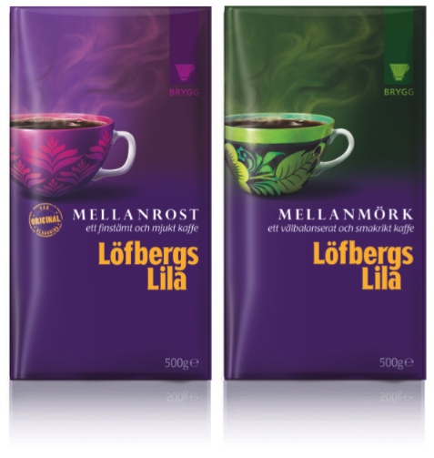
The resulting packs see the humble coffee cup transformed with flamboyant decorations which hold the values of the brand and increase variant differentiation across the range. The back of pack is also used to communicate 'Extraordinary Expertise' with an eclectic collection of coffee stories, tips and images from the Löfbergs Lila archive.

Monday, April 19, 2010

carnaby girl

The Carnaby Brown website is starting to look pretty content-rich now, here's a post from their news section that we must share, if only for the glowing review of our designer Jessica!

Thursday, April 15, 2010

welcome back!


Two weeks ago our lovely Studio Manager Amy came back from maternity leave, and has quickly settled back in to keeping everything shipshape upstairs, making sure all the jobs go through the studio effectively. She says it feels like she was never away, and we're all thrilled to have her back!

Monday, April 12, 2010

girls' night out

For the past few months we've been working on a very exciting new brand called Carnaby Brown - a brand new sparkling fruit wine created by entrepreneur Aisling Young and designed by our studio (led by Jessica, our appropriately girly senior designer). With the drink's launch now underway (using various initiatives from social networking to on-trade promotions) we want to use our blog to capture the brand's progress and some of its marketing, so to get things going may we introduce you to Carnaby Brown...


Twelve months ago Aisling (an experienced drinks marketer) identified a gap in the market for a drink that would celebrate the unique relationships between women, and the importance they place on friendship and sharing experiences. She asked us to help her created a new brand aimed at women, and - excited by the opportunity to develop a new brand and indeed a new category - we agreed to a long-term commercial partnership.

Since then, our team has been involved in all aspects of the brand's development. We work with lots of different brands, but never in a way that gives us such brutal insight into every element from conception to launch. This included both the usual stuff - identifying variants and bottle shapes, agreeing brand propositions, consumer insights and research - and the more unusual issues such as the manufacturing process, distribution agreements and the use of social and guerilla marketing. Oh, and lots of tasting, of course!

Carnaby Brown is a 5.5% abv, deliciously fruity and refreshing drink, that's rounded off with a gentle sparkle. It's directly inspired by the women it has been created for: twenty-somethings who want an ideal drink to get things going - whether getting ready for a night out with friends, meeting up after work or having a relaxed afternoon drink at the weekend. Made to an exclusive recipe in White and Rosé variants, it's a unique and sophisticated blend of perry, white and muscat grapes with the sessionability of premium beer or cider and -served in an elegant 75cl Bordeaux-style bottle - the sociability of wine too.

Our pack design balances a retro/heritage look with feminine elegance, evoking the best and most stylish of London. It captures the essence of a girls' night while steering clear of the market default of overtly girly pink floral designs.

As well as the product and design, another differentiator for the brand is its innovative advocacy marketing programme, working with social media and regional brand ambassadors who have been recruited based on their suitability as 'Carnaby Girls', and who personally spread the word about Carnaby Brown. Bearing in mind how girls love to gossip, what could be better than a bit of word of mouth?!

So now you're familiar with Carnaby Brown, we'll be keeping you posted on its progress... just watch this space!

Thursday, April 1, 2010

happy easter!


from bergen with love (and rain)

It may be all rainy and wintery here in the UK, but take heart - Bergen in Norway has a whopping 275 days of rain a year. This historic city was Anna's destination the other week, and judging by this picture she sent us in between meetings, it is quite another world (look at how the forest is eerily coming out of the mist in the background)!