Tuesday, April 19, 2011

badges of colour

I love finding out about new artists, especially when they are local to me (writes Amy)...

On a chilly Sunday morning a few weeks ago I was having a wander around Muswell Hill with my boyf... I needed a quick retail fix so left Matt outside to entertain himself. When I met back up with him he was taking photos of the floor – I thought he’d gone slightly mad but when I looked down I saw a blanket of colour & pattern. On closer look there were loads of tiny little pictures that had all been created on top of discarded old chewing gum...
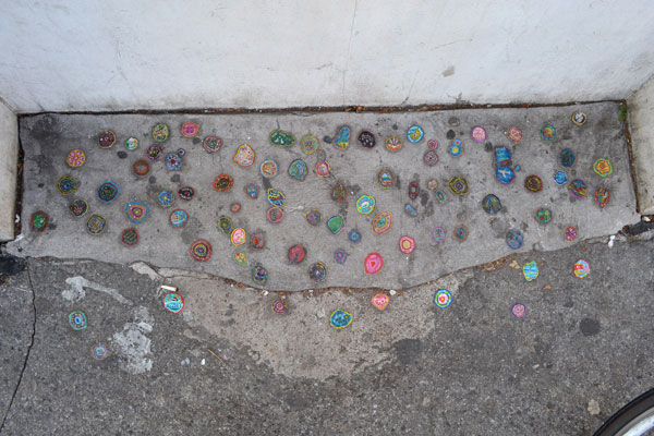


It sounds pretty disgusting but these little 'badges' of colour were amazing, packed with loads of detail! Thinking about it, I had often seen a guy lying on the floor with a paint brush in hand (as you do) and wondered what he was up to… well, now I know!


As soon as I'd spotted these pieces of art it was impossible to not keep looking down at the floor - there are hundreds around the streets of Muswell Hill, but apparently they appear all over London so keep your eyes peeled!


The artist is Ben Wilson and you can find out a little more about what he does by visiting this BBC report.

Thursday, April 7, 2011

bass notes

Kemistry Gallery in Shoreditch was recently showing an exhibition of Saul Bass movie posters, and a few weeks ago we shut the studio early to go and take a look (writes Jess)...


Story board for the shower scene in Psycho which he is actually rumoured to have directed!

Anatomy of a Murder - my pick of the show.

His film titles are incredibly simple - which is the beauty of all Bass' work and why even now he is revered as one of the all time greats of graphic design. His work is very obviously the inspiration for modern day credits such as "Catch Me If You Can".

The exhibition is now closed, but it's worthwhile having a look on YouTube for more of his film titles, they're exactly like his posters, bought to life through really simple animation... beautiful.

Thursday, March 24, 2011

drawing fashion

A couple of weekends ago I went to the Design Museum, London (writes Peter) to see The Brit Insurance Design Awards, billed as "the Oscars of the design world". I wish. Unfortunately, I soon found myself overwhelmed by the mess of projects, exhibits and unclassifiable stuff I couldn't understand or relate to. Nothing like as exciting as the 2009 show.

Luckily on the floor below was an exhibition of fashion drawings which made the trip worth the effort.

The exhibits and exhibition are small but the scope is as vast as it is fascinating, featuring a whistle stop tour through haute couture fashion from the 1920's onwards. And all seen through the eyes of some amazingly talented fashion illustrators.

Some captured a 'look' in a few gestural brush strokes...

Mats Gustafson, “Red Dress”, Yohji Yamamoto 1999

Others with painstaking filigree detail in watercolors...

George Lepape, Vogue cover 1919

While others adapted contemporary pop art techniques to show off 60's pop art fashion...

Antonio, New York Times Magazine 1967

Glamorous, inspirational and absorbing. Plus not one pixel of computer-generated images on display.

Monday, March 7, 2011

hot off the {apple} press


Here's a sneak peek at some of our latest work in Scandinavia. Quite literally hot off the press and into Stockholm's coolest bars, Gravendal cider's new design rolls out in Sweden over the next few months. Check our main site for the full Gravendal story soon.

Thursday, March 3, 2011

range architecture - the blueprint for brand success

Just as great buildings need good foundations and a clear structure, brand and product architectures are no different in how they should be approached (writes Lawrence, MD).

Brands have a life span. For many it's short, but others flourish and generate meaningful income. Consumers’ relationships with brands also have a life span, driven by generational changes or more quickly by changes in habits, taste and lifestyle.

For brand owners, reacting to these changes can be a challenge, and this often results in brand and product portfolios becoming bloated and poorly focused with little differentiation. Ironically, it's often easier to add another product to a brand's range than it is to change or delist an existing product. This is partly due to brand owners hedging their bets, and partly due to a production-led management strategy. Consequently, these bloated portfolios are more likely to confuse consumers and cause them to lose engagement with the brand they once cherished. And they become expensive to support.

The answer to this set of problems lies in range architecture
A range architecture review should begin at the point that will effect the best commercial outcome, which means exploring the brand's connection to the company's business and product strategy.

Range architecture should always refer back to commercial priorities, meaning fewer distractions from the softer science of tactical qualitative research, good guesses or an over reaction to market changes.

Of course, many businesses have extended their brands’ product portfolios over recent years. Good brands are powerful assets and consequently are seen by their owners as having the capability to accommodate more products, beyond those they might be recognised for. But this needs to be carefully managed.

Examples of good and not so good
In health and beauty, for example, Johnson’s has managed to retain brand integrity across its entire portfolio as it moved from its core offer of baby care through to women's face and body care. Branding maintains its authority across the portfolio whilst the use of colour, graphics and message hierarchy effortlessly enables the brand to reach across the categories.


However, I find Nivea much more difficult to deal with. Anti-wrinkle, firming creams, firm and natural body lotions, Nivea Visage, Nivea Soft, Nivea Pure, Nivea Sun through to Nivea Men... between them creating a plethora of range names and sub brands that makes it difficult to decipher what I am being offered and how I should find what I actually need.


And there are many more examples. Biscuits, for instance, are becoming ever more diverse, and Fox’s does a good job of presenting its variety of biscuits by using design to reflect the different styles of each one.


And whilst Old El Paso in the Mexican wraps category does a terrific job on consistency and stand out on shelf, I’m left wondering what’s inside the boxes and the wrappers!


Getting the range architecture right ensures that the platform is there for branding, design and message to be used to convey product or brand differentiation to optimum effect. Get it right and you’re away. Get it wrong and even a small range can create confusion.

Tuesday, March 1, 2011

like a moth to a flame

I’ve just realised that I have a burgeoning obsession that has crept up on me over the last few years and is reaching a bit of a peak (writes Bess).

Like a moth to a flame, I’ve become very attracted to light. From an innocuous and widespread start - a string of fairy lights that didn’t come down after Christmas one year - this has grown to a pretty serious 20m rope light strand currently framing the whole of the biggest wall in my flat, star lights strung across a fireplace grate, plain lights in a glass vase by the window (nice reflection when its dark outside). I often actively miss the oversized paper shades we had in my last flat; they were Ikea’s cheapest offer (since discontinued I think) but were absolutely huge and glowed like a full moon.


But my flat only has so many plug sockets, so I’ve taken to admiring light sources from afar. Most recently this has included the string of lights covering the entire windows of a local pub (so enticing!), the bulbs jauntily crisscrossing the street at Exmouth Market, the magical set of Matthew Bourne’s Cinderella, lights in other people’s living rooms, spied from the street, and Chinese lanterns spotted floating into the starlit sky on New Year’s Eve.


And now I’ve started finding out about light installation artists (see above, Nathan Coley, Stefan Brüggemann & Bruce Munro), and sourcing sign makers. My dream is to have a word or phrase (as yet undecided) spelt out in bright white lights on my wall, and there’s plenty of inspiration around. I just need to save up a lot of money and find another plug socket… and try not to think about the resulting electricity bill.

Thursday, February 24, 2011

boxed fascism

By Robin

In November the British Medical Association renewed their call for a ban on printed cigarette packaging. This prompted me to reminisce over the cigarette advertising from my youth, the amazingly emotive posters of both the Benson & Hedges and Silk Cut brands. Despite the restrictions of the time, these ads remained stunning works of abstract art modern advertisers and artists will never again achieve.

In 1998 a phased ban on cigarette advertising began, ending in a total ban in 2003. Before the 2005 general election the Labour party manifesto promised a ban on smoking in all public places that serve food only. After the general election an outright smoking ban was implemented - never trust a politician...

Pubs are now closing at a rate of 39 a week. A World Health Organisation study into the effects of passive smoking found that the risk of a non smoker getting lung cancer after being exposed to smoke is - in their words - "a statistically insignificant 0.01%". The ban has been seen by many as an assault on their civil liberties and freedom to decide for themselves if smoking is worth the risk and extortionate taxes demanded for the habit.

The BMA's moves to ban printed cigarette packaging comes after a report into Ireland's ban on all point of sale advertising. The report states that "there were no short-term significant changes in prevalence among youths or adults", clearly stating that the Irish ban has had little effect on cigarette sales. Despite this contradiction the BMA and powerful anti-smoking lobbyists are pushing ahead with their demands. Judging by the history of cigarette advertising they are very likely to achieve their goals.

This, to me, is a tragedy. I have many friends working for design companies, proofing and mockup houses who rely on tobacco companies for their livelihood. This ban would overnight rob them of their jobs and security, and rob our industry of skills, crafts and disciplines we should all be proud of. This is not just an ill conceived attack on our liberties, but an attack on an industry already at its knees through no fault of its own.

It almost makes me want to take up smoking, almost...