
Have you seen the Homepride cooking sauces ad yet? If not,
take a look. It uses the iconic Fred character - 50 this year don’t you know?!
As I remember Fred he was a charming, helpful, friendly chap that knew his
grades of flour. And, voiced in ads by the homely sounding Richard Briers (sadly no longer with us)... now that tells you
something about his character.
So, back to the ad that aired for the first time over the
weekend. It shows a giant Fred - not the small iconic character that we all
remember - helping Mum in the kitchen to add a bit of cook in sauce excitement
to dishes for the family to enjoy. Nothing particularly wrong with that -
except for the fact he’s so huge and a bit wobbly on his feet.
The real trouble comes at the end, when Dad
discovers that Fred is taking that excitement a little too far. He is seen in
the bathroom with Mum in the bath, readying himself to scrub her back.
Now, whilst I think the idea is somewhat tacky (and a little
pervy), I can see it might give way to a Carry On style of humour.
But the problem is this: for the past 18 months we’ve been
using social media (Facebook & Twitter) to nurture Homepride Flour and its Fred
character into that charming, helpful, knowledgeable and lovable being that we
want to project for the brand - licensed to Kerry Foods and not strictly
owned outright by Premier Foods, who owns Homepride cooking sauce.
So, having nurtured Fred and his character to promote
Homepride Flour, we now have the cooking sauces side of the business building a
character that has quite a different take on charm and lovability. And particularly with heritage brands that have been off the
radar for a few years, they still have emotional values attached. So it’s vital
that they are understood and re-presented to a modern audience in a way that
retains integrity.
To me, the take on Fred from the sauces side has dangerously ignored
what Fred has always stood for and his personality. And all for a cheap laugh.
Showing posts with label fmcg. Show all posts
Showing posts with label fmcg. Show all posts
Wednesday, September 24, 2014
Friday, April 11, 2014
perky

Look out for our latest launch to hit the shelves - Percol's Perk Up! The two-strong range of luxury coffees have added guarana for a natural lift, which our packaging reflects with an explosion of colour...
Friday, April 4, 2014
flashback friday
We've just come across this great article about a locked cupboard that was forgotten for 40 years, and when it was finally opened recently it revealed a fantastic look straight into FMCG packaging's illustrious past... an accidental museum of brands!

Friday, February 7, 2014
dough raising
At the end of last year we were involved in the Wallace & Gromit Children's Charity's BIG Bake, through our client Homepride Flour. Homepride was supporting the event, which asked people around the UK to put on bake sales during BIG Bake week (2nd-8th December 2013). The money raised would help improve the quality of life of sick children and their
families in local hospitals and hospices across the country.
It's such a fantastic cause, and we were very pleased to be part of it. We've just heard that in total a fantastic 189,000 people took part, and £50,000 was raised!
For us, the BIG Bake was also a great chance to get Homepride Flour's new social media presence up and running, and indeed flourishing. Watch this space for more plans in 2014 as Homepride's Fred celebrates his 50th!
Monday, December 2, 2013

Thursday, November 21, 2013
have you seen this man?
Homepride’s Flour Grader Fred has been sighted on Facebook and Twitter recently… doing the rounds promoting both the new Homepride Flour packs (designed by yours truly)and the Wallace & Gromit Children’s Foundation’s BIGBake fundraising event (of which Homepride Flour is a supporter).
 after and before
after and beforeMonday, November 11, 2013
whip it!
And the next project that has recently come to fruition is... Orley Whip. Although the name might not be familiar, it's an iconic cream/dessert topping brand in its South African homeland. The two-strong range has been modernised and brought bang up to date, initiated by a move from a messy individual sachet format to a much more convenient pouring bottle.
 Orley has also made a foray into the foodservice market, with the use of an on pack endorsement from Kerrymaid. Cream of the crop eh?!

Thursday, October 3, 2013
arabian delights
Apologies for the radio silence over the summer. But, we've been hard at work on lots of projects that are now coming to fruition.
First up is Bis*Bas, a new range of very delicious Middle Eastern sauces. They can be used in any number of ways, as cooking sauces, dips, relishes, straight from the jar on a spoon...
They're made by the lovely sisters-in-law Muna and Muna (cook and entrepreneur respectively), inspired by authentic recipes that have passed down through generations. We heartily recommend that you look out for the distinctive jars, they're a great way to pep up any meal. Yum!
Wednesday, May 29, 2013
splash screen
Watch out for the new - and first ever - Brecon Carreg water TV ad, coming to a small screen near you (as reported in The Grocer this week):

Friday, May 3, 2013
brand new brecon
We've recently redesigned the packaging for our bottled water client Brecon Carreg. The updated design takes inspiration from the small team that produce the water in the foothills of the Brecon Beacons - the heart of Wales. Nik came into the studio earlier this week with a proud grin, having unexpectedly spotted the multipacks in store (see below)!


Wednesday, August 1, 2012
adventures in coffee

To help celebrate coffee brand Percol's 25th anniversary, we recently redesigned its ground coffee range (see pics), giving the packs the stand out on shelf they deserve.
The idea behind the brand is 'Adventures in Coffee' and we reckon the new packaging reflects this while clearly differentiating the wide range of variants...

Thursday, July 26, 2012
limited edition packaging - a chance to jump on the bandwagon or add real value to your brand?
London, UK 2012
Red, white and blue dominate the retail environment at the moment. With a busy year for Great Britain including the Queen’s Diamond Jubilee, a Brit in the Wimbledon Finals and the Olympics being hosted here, there is surely every reason to drape the Union Jack around the shoulders of your brand and join in the patriotic spirit….and of course hope for a lift in sales during these otherwise quite dreary times of austerity and rain!
But is all this really adding brand value, or simply hopping onto the bandwagon of nationalistic pride in the hope of some short lived commercial gain?
Take for example Twinings. Awarded the Royal Warrant in 1837 and now offering over 100 varieties, the launch of a limited edition range in celebration of the Queen’s Diamond Jubilee is wholly in keeping with the brand’s core values, as is the stunning detail of the packaging. No flags here – just a gold carriage and commemorative ‘royal’ detailing beautifully embossed around the oval caddies (loose tea) and rectangular caddies (tea bags) – something to suit every street party. And each format is available in 3 colourways, making the set not only collectable but the packaging reusable too.

At the other end of the spectrum I see M&Ms – a wholly
American brand which, with a little help from UK band Little Mix, has chosen to
launch a limited edition pack of red, white and blue sweets (or should that be
candies) with the Union Jack proudly splashed across their packaging. With no
apparent link back to the brand at all, beyond the limited edition packaging
there really is not much for the consumer to engage with. Shame on you MARS!

That’s not to say that only British brands should benefit in
2012. P&G, another US multinational (and Worldwide Partner of the 2012
Games), has joined forces with Boris Johnson, Mayor of London, to launch
limited edition packaging to support the P&G Capital Clean up campaign, a
series of clean up events designed to bring an army of 1,700 community
champions together to spruce up more neglected areas of the city ahead of the
Olympics. This links the household cleaning brands of P&G perfectly with
the trend of growing local community spirit and pride, and of course with the
Olympics.

So, the launch of limited edition packaging can be hugely
beneficial to brands - it can refresh awareness, deliver shelf standout and
drive consumer interest. But it will only add real value to the consumer if it
responds to a true insight and reinforces their own present associations with
the brand, and demonstrates a genuine reason to purchase beyond price alone.
Red, white and blue dominate the retail environment at the moment. With a busy year for Great Britain including the Queen’s Diamond Jubilee, a Brit in the Wimbledon Finals and the Olympics being hosted here, there is surely every reason to drape the Union Jack around the shoulders of your brand and join in the patriotic spirit….and of course hope for a lift in sales during these otherwise quite dreary times of austerity and rain!
But is all this really adding brand value, or simply hopping onto the bandwagon of nationalistic pride in the hope of some short lived commercial gain?
Take for example Twinings. Awarded the Royal Warrant in 1837 and now offering over 100 varieties, the launch of a limited edition range in celebration of the Queen’s Diamond Jubilee is wholly in keeping with the brand’s core values, as is the stunning detail of the packaging. No flags here – just a gold carriage and commemorative ‘royal’ detailing beautifully embossed around the oval caddies (loose tea) and rectangular caddies (tea bags) – something to suit every street party. And each format is available in 3 colourways, making the set not only collectable but the packaging reusable too.
Thursday, July 28, 2011
award for the most creative use of structure goes to...
 Spotted by Nik in Harvey Nichols Food Market
Monday, March 7, 2011
hot off the {apple} press

Here's a sneak peek at some of our latest work in Scandinavia. Quite literally hot off the press and into Stockholm's coolest bars, Gravendal cider's new design rolls out in Sweden over the next few months. Check our main site for the full Gravendal story soon.
Wednesday, December 8, 2010
pie cases
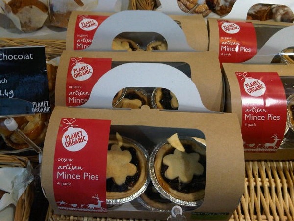
Although they've been available in the shops for quite a few weeks, now seems like an appropriate time to share these mince pie packs that make nice use of the festive design we created for Planet Organic to use across a whole range of packaging and point of sale.
Tuesday, October 12, 2010
spotted in Stockholm
Our eagle-eyed Creative Director Nik often comes back from business trips with news of new products and designs to share with the studio. His latest dispatch concerned Unilever's Swedish Flora packs. Says Nik: "Very odd... looks like something your Gran might have in her bathroom. That said, I bizarrely quite like it!"


Friday, September 10, 2010
lighten up
Some of our latest Swedish work - for retail giant Axfood - is being rolled out this/next week. We've designed the packaging and instore communications for a new range of low energy lightbulbs. Ever heard of a lumen? Well, it's what the light output of these bulbs is measured in (rather than watts) so a big part of the challenge was to educate the consumer and take any confusion out of the equation. The bulbs are both energy and money saving in the long run, so pretty good all round!

And here they are in situ...


And here they are in situ...

Tuesday, July 20, 2010
lunch break
One of our newest clients is Planet Organic - the UK's largest certified organic supermarket. We've been working on the branding for their new Food To Go range of salads, sandwiches and bakery foods, which are launching imminently under the name "Filling Station".


Planet Organic caters for all sorts of dietary needs, from dairy, wheat & gluten free, to vegetarian and vegan, to nutritious superfoods, and our packaging clearly highlights the dietary benefits of the range.
We used a combination of typographic and graphic elements for an upbeat, urban feel that adds a confident and relaxed dimension to the existing Planet Organic branding. Watch this space for further applications of the design onto bags, napkins and more, as well as an extension into other foods later this year.

Tuesday, May 4, 2010
the best taste under the sun

So we got in touch with Lotte and it turned out that retailers and customers were thinking the same thing. People also found the large number of muesli and granola variants really confusing (bit of a problem for a brand hoping to grow).
Fast-forward six months and the newly designed and streamlined muesli and granola range is shipping to retailers this week, along with a new positioning, tag line, brand identity, website, sales presenters and newsletters.

So how did we get here? Our starting point was simple - Southern Alps' unique Slow Dried Fruit process. They use the very best fresh fruit, dried with warm air and nothing else to retain maximum flavour, nutrition and goodness. Sugar and preservatives are never used, and the resulting fruit really does have the best taste under the sun!
We also took inspiration for the brand's personality from Lotte herself. She's one of the most unforgettably quirky, seriously intelligent and unapologetically passionate people we've come across. And because this is a brand packed with meaning and provenance, we had to tell some of its great stories, so the back of pack features little anecdotes. Take the Slow-Dried Pineapple for instance, which is produced by farming groups in Southern Uganda. The pineapple is grown in naturally fertile soils, picked when fully ripe and then dried immediately to capture its wonderful natural sweetness. The solar drying method used minimises the impact on the environment and by drying the pineapple in Uganda, just 1kg of dried pineapple is shipped for every 15kg of fresh pineapple harvested, reducing the environmental impact of its transportation.
Now for the burning question: is the new design working? Well, there's been a phenomenal response from the trade - every single retailer has been very positive about the new look and the brand has got listings in Ireland for the first time. We'll keep you posted on how the story develops, and will share our work on the rest of the Southern Alps range as and when it happens.
Wednesday, April 21, 2010
coffee break
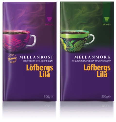 We've recently completed a big project redesigning the full range of packaging for our Swedish client Löfbergs Lila, one of the biggest coffee roasters in the Nordic region. Using the proposition 'Extraordinary Expertise', we married the professionalism and passion of family-owned brand, and communicated its unique and distinctive personality.
 The resulting packs see the humble coffee cup transformed with flamboyant decorations which hold the values of the brand and increase variant differentiation across the range. The back of pack is also used to communicate 'Extraordinary Expertise' with an eclectic collection of coffee stories, tips and images from the Löfbergs Lila archive.
Subscribe to:
Posts (Atom)