Tuesday, February 8, 2011

inspiring toys

Last week I read about a sculpture by Lorenzo Quinn titled ‘Vroom Vroom’, placed outside the Dorchester Hotel, and it really caught my attention, so I jumped on the tube that very evening and headed down to Park Lane to see it in the flesh (writes Sachin).

I was amazed by the 13ft high sculpture of a child’s hand pushing a vintage Fiat 500, placed between the central reservations before a set of traffic lights, to catch the attention of passing drivers. Artist Lorenzo Quinn created the sculpture to symbolise a part of his independence, freedom and personal growth.

Seeing it sparked great memories in my mind of my childhood and my desire to one day own a yellow Lamborghini Diablo with its magnificent scissor doors and sharp edges.

When I was young I always had a toy car in my pocket, and played with it wherever and whenever I possibly could. I remember making a racket, humming the sound of a car engine. I would drive my car on the carpet and up the stair rail, scratching off the paintwork. I'd create buildings, garages, ramps and tunnels using old cardboard boxes, plastic containers and toilet roll tubes.

The best trick of all was when I used to smuggle my cars into the bathroom, wrapped in my towel, hidden away from my mum. I would play with them around the tub and at the bottom, imagining I was driving deep under the ocean. I had to smuggle them in because my mum used to go crazy at all the scratches I made in the tub, and boy did I get a telling off every time!

I also remember collecting vouchers from the back of cereal boxes, magazines and the Shell petrol station, gradually getting enough to buy a new car to add to my huge collection.

I remember the excitement of getting my cars home, getting the screwdriver out the tool box and unscrewing the car from the stand it came attached to in the box, then taking them for a spin. I had a finger duster made from a piece of dust cloth and I used to polish my cars just like my dad did, keeping the collectable ones in pristine condition.

My favourite car of all time was - and still is - the yellow Lamborghini Diablo. I had the amazing Bburago model that felt and looked like the really thing. It was my most precious toy, beautifully crafted with realistic detail, from the texture of the seats, the look of the dials, the engine, the metal body kit and best of all a steering wheel that worked! You could put your finger through the window and steer the car along.

Back then, I always dreamt of owning my very own, and the dream still lives on...

Friday, February 4, 2011

periodic type

I can still remember that 'light bulb' moment, in my school boy days, when the Chemistry teacher revealed the "Period Table of Elements" (writes Peter).

Ping! Now I understood why metal rusted and plastic didn't. That Krypton really existed. And Copper, Silver and Gold all looked shiny because they were related.

As it turned out chemicals never featured much in my working life. But typefaces did and became an obsession.

Sadly, I started to notice how over the past few years my interest in typefaces has blurred. I've changed from highly opinionated to confused when it comes to choice. Maybe too much time spent with default browser fonts combined with less and less work in printed graphics? (I've not smelt printing ink for ages.)

I'd come to accept my 'typeface compass' had broken. Like computer music loops, own brand cereal packs and reasonably priced cars - they'd all started to sound and look the same. Maybe time for an overdue 'light bulb' moment?

Queue my discovery of the truly remarkable, absorbing, fascinating and unbelievably clever "Periodic Table of Typefaces".


Ping! Now I rediscovered why Helvetica is a truly elemental typeface. And why Gotham and Trajan are unlikely to react well together. Or why Baskerville, Garamond or Caslon are worth considering for typesetting novels or reference books.


However, I have noticed that there's one highly explosive, dangerous, and volatile typeface which hasn't made the table. I'm pleased. Bye bye Comic Sans !

Tuesday, February 1, 2011

typographic travels #01


The first in an occasion series from Nik. As a well seasoned traveller and total type obsessive, Nik takes shots of any typographic inspiration he encounters along the way. Nik says "I like the good, the bad and - more often than not - the ugly! The worst typography can sometimes be the most beautiful". We've persuaded him to share some of the photos he's captured on his travels for both work and pleasure...

#1: Fazer, Helsinki, Finland
Just a giant, beautiful slab of almost brutal Russian-esque typography with a weird art-nouveau twist. Check out the beautiful 'A' and that bonkers 'R'. Love it!

Monday, January 17, 2011

marrakech

I'm about as spiritual as a sock (writes Jessica), but on my first night, sitting at a rooftop cafe overlooking Jema Al Fina listening to the call to prayer I certainly felt something stir inside. Mind you that could well have been something to do with the amount of food my friend and I had eaten earlier. There were so many amazing market stalls selling colourful dried fruits, nuts and aromatic spices you could bottle the smell of Marrakech and sell it.

We spent the first part of our holiday exploring the narrow winding streets the locals call the souks. You can buy everything from your own authentic tagine to sequin-embellished sunglasses. After exhausting our shopping budget we set off on a real adventure - a two day drive to the Sahara desert. I can't do the desert justice by describing it but the photo at the end can give you some idea of how remote it really was. I travelled with two local guides and my friend Hanna and the four of us drank Moroccan tea and watched the sun rise over the sand. We were only away from the office for a week but it felt like we'd had the trip of a lifetime in those seven days. Incredible.

(that's Hanna walking up the sand dune in the last picture)

Thursday, January 6, 2011

happy new year resolutions

It's 2011, so that means some of us are making resolutions to either give up, do more or change something in our lives. Chris Streger came up with the ide of the 'To Resolve Project', a challenge to illustrators and designers to create an iPhone wallpaper featuring their New Year's resolution. The results are some of the best looking resolutions I've seen, and although I'm not normally very good at sticking to my resolutions, I will keep checking Chris's blog to see what others are (rather beautifully) resolving to do.


Tuesday, December 14, 2010

Wednesday, December 8, 2010

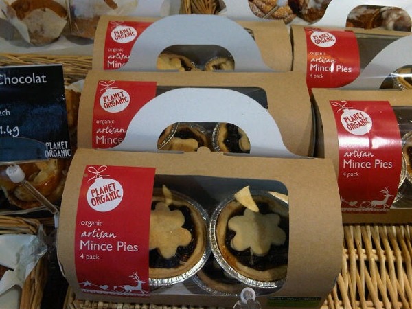
pie cases


Although they've been available in the shops for quite a few weeks, now seems like an appropriate time to share these mince pie packs that make nice use of the festive design we created for Planet Organic to use across a whole range of packaging and point of sale.